Showing posts with label data viz. Show all posts

CityEngine: ESRI and Lumion a first look.

Yesterday a license for CityEngine landed on our desk from the nice people at ESRI and to be honest we were a little too excited for our own good, after all its only software. However, CityEngine and its integration with ESRI ArcGIS, while maintaining full export capabilities to load into 3DMax/Lumion/Unity etc, is a game changer.


It moves GIS visualisation a step forward while at the same time bringing procedural city modelling into the mainstream game engine world. Over the coming weeks we will be putting the software through its paces and exporting into Max/Lumion and Unity as part of introducing CityEngines onto our MRes in Advanced Spatial Analysis and Visualisation. The clip below details out first output direct from CityEngine into Lumion, adding in a general landscape, sample trees and transport objects:


Linking in our previous post on ArcGIS Twitter Visualisation in Lumion it seems that the worlds of GIS and architectural visualisation/game engines are finally starting to become accessible.

London's Twitter Island - From ArcGIS to Max to Lumion

As part of the MRes in Advanced Spatial Analysis and Visualisation, here in CASA at The Bartlett, University College London, we are exploring new methods and techniques for visualising data. As part of the course we are looking at collecting data from the Twitter API and using the resulting .csv file as an input into a variety of software, including Processing and ArcMap.

One such known example is the London Twitter map by UrbanTick, developed using the data collector created by Steven Gray and imported by Fabian into ArcMap, it developed a style of its own as the 'NewCity Landscape' collection. From a digital urban point of view the next stage of the map is a 3D extension, a transformation that proved surprisingly difficult due to the nature of combining the worlds of traditional GIS and game engines such as Lumion.

We are still in the early stages of development but the movie below illustrates the NewCity Landscape Map of London visualisation in Lumion as a 'Twitter Island':


Music by Pigeman over at MP3 Unsigned. There are of course many arguments on the pro's and con's of visualising data in such a way, indeed the visualisation is developed to open up the debate as part of the MRes course allowing various visualisation techniques to be compared from the same data set.

We will have more updates as the visualisation develops, along with a walk through of how to build it. If your interested in such output our MRes is now open for applications, entry 2012-2013...

All the London Datastore Maps

Richard Milton here in CASA is working on our new National Centre for Research Methods funded TAILISMAN project. One aspect of the project is looking into data visualisation, here we present a guest post by Richard on the automatic visualisation of data from the London Datastore...

This started out as an experiment in how to handle geospatial data published in Internet data stores. The idea was to make an attempt at structuring the data to make searching, comparison and visualisation easier. The London Datastore publish a manifest file which contains links to CSV files that are in the correct format for MapTube to handle, so I wrote a process to make the maps automatically. The results are one thumbnail map for every field in the first hundred datasets on the London Datastore. I stopped the process once I got to a hundred as it was taking a long time.


 A section of the results are shown below:


You can view the zoomable version via the full 10,000 pixel image created using the Image Cutter.

The name of the dataset and name of the column being visualised are shown in the top left of the map, while the colour scale is a Jenks 5 class range between the min and max of the data. This sort of works, but raises more questions than it answers about the data. To start with, one interesting thing that jumps out of the data is that there was a step change in London population around 1939, from the “London Borough Historic Population” dataset.
The first problem with this is that there is no structure to how the thumbnail maps are placed on the image. The idea is to use a data classifier and group maps according to how similar they are, so distance would be proportional to similarity. This work is still in progress.
The next problem is with the colour scales, as it commits the cardinal sin of not showing one. The maps are supposed to be representative, so all use the green Jenks 5 classes, but it’s obvious that this has gone wrong on most of the maps. The reason for this is that the London Datastore include data in the CSV files at different geographic scales. Most of the maps show London at Borough level, but also contain data for England, Scotland and Wales which mess up the automatic colour scale. The top range ends up being the larger geographic areas which you can’t see, so the maps end up with just four classes on them. On some of the maps you can see the Government Office Regions (Midlands, Wales, South East etc), along with Borough level data for London.
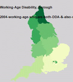
A map showing data at different geographic scales. London has data at Borough level while the rest of the country is at GOR level.
The final problem, which also relates to different geographic scales, is to do with almost all the maps visualising either a count of people or events. Most maps are a population of some kind, so displaying population density rather than count would make a lot more sense.
As a proof of concept, this demonstrates that we can handle the maps automatically from an Internet data store. One thing that’s obvious from looking at the zoomable map view is that you need the ability to click on one of the thumbnails and go straight through to the full size map with all the information about what is it. There is also no search facility so you can’t find anything, but the next proof of concept is where things will start to get interesting....

We will be following progress and the forthcoming TALISMAN project blog with more results in the new year.