Showing posts with label twitter maps. Show all posts

Data Space: Agent Based Models, SketchUp, Visualisation, ArcGIS and Lumion

Over the past few weeks we have been exploring exploring new methods and techniques for visualising data. Developed as part our Masters course in Advanced Spatial Analysis and Visualisation we are now looking into issues of scale, realtime rendering, rapid visualisation and 3D exhibition spaces.


Regular readers will know we have been exploring Unity due its interactive nature and ability to import various file types into its game engine (see Particles, Agents and Emergent Behaviour ). Unity is still an option but for rapid visualisation Lumion also offers distinct possibilities. The movie below details our first draft example of building an exhibition space (SketchUp), retexturing and adding various crowd/delegate models (3DMax) and the Twitter map (ArcGIS) using Lumion:


If Lumion offered a stand alone viewer rather than purely movie based output then it would be our engine of choice. As such it is currently a weigh up between Lumion and Unity, our Unity example is under development, we will post it soon as we can...

Tweet-o-Meter: Now with 16 Cities

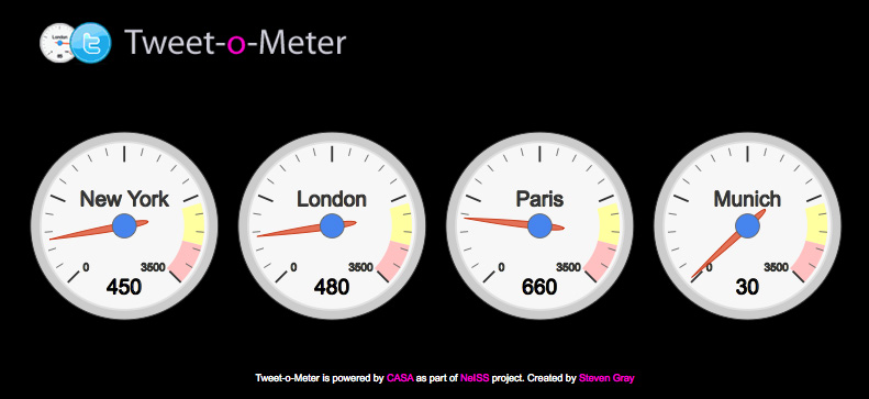
We have added four more cities to 'Tweet-o-Meter': Hong Kong, New Delhi, Shanghai and San Paulo. Is it true that, New York is the city that never sleeps? Do Londoners send more Tweets than New Yorkians'? Is Oslo a bigger Tweeter than Munich? Is Tokyo into Tweets as much as Barcelona?


The Tweet-o-Meter measures the amount of tweets (measured in Tweets per Minute or TPM) received from various locations around the world. The gauges are updated every second giving you a live view of the TPM's in each location.


The system is designed to mine data for later analysis relating to furthering our understanding of social and temporal dynamics for e-Social Science within the Twitter demographic, its output allows new 'tweetography' maps of cities to be created.


See the New City Landscape post over at UrbanTick for full details and the music video behind the original choice of cities or head direct to the Tweet-o-Meter Page.

The big news is that from October 13th you will be able to view our analog version of the Tweet-o-Meter at a notable literary venue in London, more details on that soon.

New York, London, Paris, Munich: Tweets Per Minute via our new Tweet-o-Meter

‘New York, London, Paris, Munich everybody talk about Pop Musik’ – that was 1979 and the catch line by the group M. As such we thought it would be interesting to mine what people are talking about in 2010.

We are planning to log all geolocated Tweets in NewYork, London, Paris and Munich over a 24 hour period via the Twitter API as part of research under the NeISS project in association with UrbanTick and ourselves here at Digital Urban, part of CASA, University College London.


The system is running in beta mode over the next week with visualisation of the Tweets per Minute provided via our Tweet-o-Meter. While the reference to the 1979 is all well and good the system is actually designed to mine data for later analysis relating to further our understanding of the social and temporal dynamics of cities within the Twitter demographic. These can be mapped allowing us to capture 24 hours in the life of the city.

Below is an example of the type of base output we expect, as we are also extracting the social data and retweets we can map this in both time and space. UrbanTick has a nice tutorial on how to the do the timelapse of Tweets below:

London Weekend on Twitter from urbanTick on Vimeo.

Currently in beta mode the Tweet-o-Meter updates every 10 seconds displaying the city with the highest number of Tweets, the logged 24 hour period will be announced next week. Once collected we will be able to create city maps detailing the Tweet activity over time and space, a wider ranging system will be launched as part of a free data collection service via NeISS in the next couple of months.


See http://www.casa.ucl.ac.uk/tom/ to view New York, London, Paris, Munich via Tweet-o-Meter and if your in one of those cities and want to take part, simply make sure you have geolocation turned on in your Twitter preferences.

For those too young or perhaps simply nostalgic for the late 70's/early 80's hit that inspired the work, here is PopMusik via YouTube (its great...).

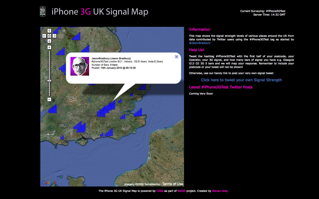
iPhone 3G Signal Map via Twitter

Expanding our work on gathering geographic data via Twitter Steven Gray here at CASA has created our latest version - this time showing the signal strength levels of iPhones on the 3G network around various places in the UK. The data is collected data via Twitter users using the #iPhone3GTest tag as started by Jason Bradbury from The Gadget Show on Channel 5.

The map updates every 3 minutes and a list of Tweets in icon form should go online this afternoon.

You can add to the map by tweeting the hashtag #iPhone3GTest with the first half of your postcode, your Operator, your 3G signal, and how many bars of signal you have e.g. Glasgow G12 O2 3G 5 bars and we will map your response. Remember to include your postcode or your tweet will not be shown.

Otherwise, use our handy link to post your very own signal tweet: Click here to tweet your own Signal Strength.

What is now needed is a global version, we are on the case....

The work is funded as part of the part of NeISS (National e-Infrastructure for Social Simulation) providing a platform to meet the demand for powerful simulation tools by social scientists, public and private sector policymakers.

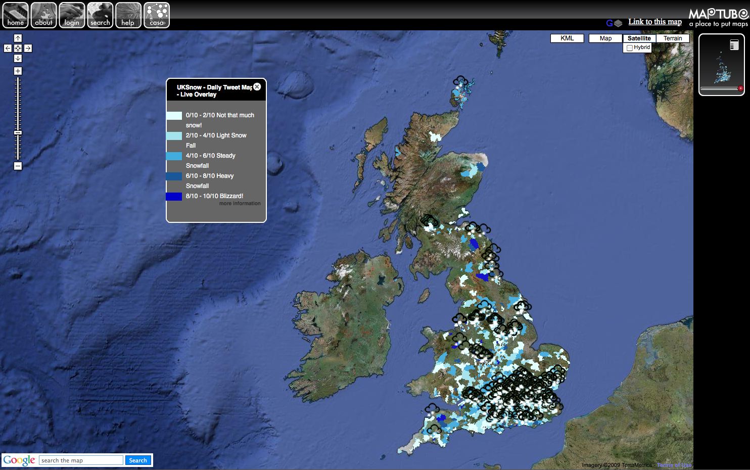
Twitter 'Geographic' UK Snow Map - Tweets and Postcode Districts

Combine near real-time geographic rendering and social networks such as Twitter and you get a tool that can use the power of the crowd to display detailed geographic information and collect data. We are launching such a service in a few weeks time, building on our previous work for the BBC and their 'recession mood maps'. Produced as part of our NeISS project, the service will allow anyone to carry out a survey and visualise the output based on geographic areas such as 'country' 'county' 'ward' 'postcode area' etc.

As such Steven Gray here at CASA has produced a proof of concept showing the last hours snow fall in the UK as Tweets and the last 24 in postcode districts (the important part here is the data underneath, not the Tweets as such):


The map is a 'hybrid' of the excellent work by Ben Marsh with his #uksnow Map 2.0, it takes the postcodes and maps the regions with tweets, providing an interesting route to harvest data from Twitter.

You can see the map running live from MapTube - the map dynamically refreshes with fresh tweets every 3 minutes with the areas updated every hour, the map automatically resets itself at midnight.

At the moment the kml is refusing to be clickable via MapTube so if you want a Twitter Map without the postcode areas take a look at Stevens UK Snow Dynamic Crowd Sourced Maps - again it updates every three minutes with Tweets about snow in the last hour - its very neat.