Showing posts with label Mapping the Credit Crunch. Show all posts

Mapping the Credit Crunch - MapTube on the BBC


With a slightly different hat on from our normal urban visualisation work we also run our National Centre for e-Social Science grant here at CASA. One of the biggest successes of the grant has been MapTube which is based on our GMap Creater software developed by Richard Milton here in the lab.

An up and coming feature of MapTube is the ability to carry out near real-time geographic surveys, the latest of which is the new Credit Crunch Survey by the BBC Radio 4 PM show.

Key to public surveys and getting enough inputs to get a nationwide view is exposure, thankfully our latest survey is currently featured on the main BBC frontpage, significantly increasing traffic and thus survey results.

See the BBC iPM page for full details on the survey.


On a more regional level we are also running a survey to map peoples views on job security in association with BBC Look East. See the BBC Look East page for more details.

If you would like to know more take a look at our online publications page as we talk about MapTube in a number of the latest papers..

Viewing the Credit Crunch Over Time: Motion Graph Mapping

Maps represent a moment in time and when your creating a mood map of the United Kingdom. In relation to the countries on the impact of the Credit Crunch, 24 hours can be a long time, as we explore below.

Our work with BBC Radio 4's PM show is yielding interesting results with the fuel prices coming out as the nations biggest concern in these times of tight credit. Yet look closer at the data and it becomes clear that the nations mood has shifted over the last few weeks.

To recap, listener's are being asked to answer the following question:

What single factor is hurting you most about the credit crunch?

Please select one of the answers below:

Mortgage or Rent
Fuel
Food Prices
Holidays
Other
The Credit Crunch is not affecting me


We generated a new map every 30 minutes, providing an up to date view of the nations mood.

In addition to mapping the data it can also be analysed over time, the image below represents the percentage of answers on May 1st:
On May 1st the nations biggest concern was the price of food, yet by May 3rd fuel had taken over with food slipping back down in terms of overall percentage:
The nations mood over the last few weeks has been changing quite notably over time, perhaps in relations to the amount of media coverage anyone topic has received. Food prices were in the news earlier in the month and now fuel prices are hitting the headlines with the current blockage of London by lorry drivers.

At the present time fuel prices are again leading the poll, you can view the timeline using the interactive version embedded below. Annoyingly Google Docs does not save the viewing preferences when embedding motion graphs so to match our set up simply:

Click below to set both size and colour to view by percentage and move the time slider to gain a unique insight to the nations mood over time.

If you click each circle it will highlight each category in turn to match the images above:


The data poses the question if we as a nation are indeed worried about the credit crunch or is it the media inducing worry by the the amount of coverage given and shock headlines?

You can view the map at http://www.maptube.org with full details on the BBC's iPM page.

Mapping the Credit Crunch: Mapping the UK's Mood with Radio 4

Over the last few weeks Radio 4's PM show has been carrying out a survey on the UK's fears on the Credit Crunch. In association with our MapTube site at CASA listeners were asked for the first part of their postcode and to answer the following question:

What single factor is hurting you most about the credit crunch?

Please select one of the answers below:

Mortgage or Rent
Fuel
Food Prices
Holidays
Other
The Credit Crunch is not affecting me

We generated a new map every 30 minutes, providing an up to date view of the nations mood.


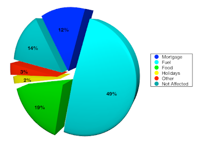
The results are fascinating, with over 22,000 responses 49% were most worried about fuel price with food running in second at 19%. The interesting part for us is to view these results both statistically and geographically as the results come in, to date the breakdown is as follows:


You can view the map at http://www.maptube.org with full details on the BBC's iPM page - of note is the rural/urban split with urban areas being notably more worried about mortgage or rent payments compared to other areas of the UK.